The Top Landing Page Examples
The Top Landing Page Examples
Landing pages act as both marketing collateral and sales tools. Learn the best practices for landing pages from these stellar examples.
A business website is one of the key ingredients of a successful company. Of the 329 million people in the U.S., 293 million, nearly 90% of the population, are internet users. A website presents the most effective, inexpensive means available today to reach these users.
That’s where landing pages come in. A landing page is a marketing term that refers to a unique page on your website constructed to accomplish specific business objectives. Internet users visit your landing page through a marketing campaign.
For instance, visitors to your landing page might arrive via a marketing channel such as an online advertisement. They clicked on your ad to learn more, and are taken to the landing page where they’re presented with content geared towards accomplishing your business objective, like collecting their email address to move them into your sales funnel.
Today, content management systems lets you build landing pages without requiring you to have deep technical knowledge. Still, before diving into landing page creation, you need to know how to design them to achieve your business goal.
Let’s explore some landing page samples to help you learn how to design your own.
7 best landing page examples you can learn from:
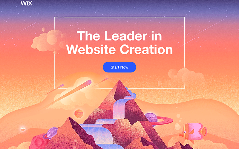
- Wix
- Shopify
- Clearbanc
- Lyft
- Zoho
- Mailchimp
- JustAnswer

What all successful landing pages have in common
Although every landing page is uniquely designed to achieve a specific business objective, they all exhibit the same key characteristics. To maximize the success of your landing page, include these elements.
User-friendly design
Arrange content on the landing page to focus on your objectives and to encourage visitors to take action by employing a user-friendly design. This concept entails creating a webpage that visitors find pleasurable, informational, and easy to use.
To execute a user-friendly design, strip the page of any distractions to encourage visitors to act on your goal, such as buying your products. Also, use a clearly visible call-to-action, a marketing term referring to instructional text designed to generate an immediate response.
For example, if you want visitors to sign up for a newsletter, limit the content on the page to discussing the merits of the newsletter, and display a call-to-action to get them to sign up.
Read more: https://www.fool.com/the-blueprint/landing-page-examples/


