
Why bother with user experience: UX tips for SEO experts and business owners
he times when ranking high in search results as the final goal have passed.
As search algorithms are improving and there’s no place for keyword stuffing anymore, SEO experts should adopt for trends coming and replacing each other too fast.
Today SEO involves loads of practices including link building, technical optimization, proper keyword research, and more. Although the process of boosting websites’ rankings is challenging enough, it isn’t the only task SEO specialists should cope with. To help businesses engage their target audience and make them convert is the problem falling to SEO practitioners as well.
Here comes the need for UX optimization, which is impossible not knowing what matters most of all for the target audience coming to the specific website. In this article, I’ll tell you about the most important steps to focus on for your customers and how to improve the user experience.
The debate rages: How much does UX count?
UX = CTR in some way. The debate about CTR among SEOs is evergreen, really. Everyone tries to defend his or her point of view despite Google’s statements on this issue. And recently, a new wave of discussion sparked up after the tweet of Moz SEO, Britney Muller. She tweeted about a new Google document that implies CTR matters for ranking.
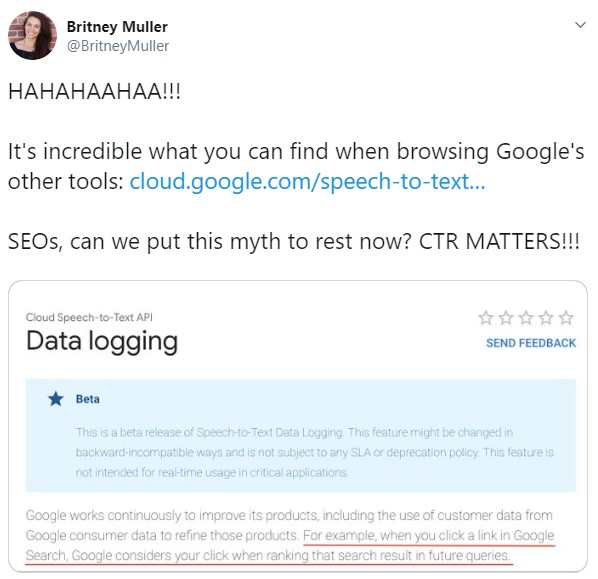
Different SEO specialists expressed their opinions and tried to confirm or deny this fact, as several weeks before that Google also said CTR for ranking is made up.
For example, Barry Schwartz said that this new doc is “Confusing. Google did write “when you click a link in Google Search, Google considers your click when ranking that search result in future queries.” They should clarify that it is used for personalized search.”
Regardless of all these debates, CTR and UX itself is a great practice. Even if it doesn’t improve your rankings, it’ll make your site more understandable, comfortable, and informative for visitors.
Why should SEO pros bother with user experience?
It may seem that being number one on Google search results is key to an engaging audience and driving conversions. It’s not quite so. Every improvement of search algorithms Google brought in recent years is focused on providing user-friendly results. Of course, domain authority and quality links are still important, but if the website ranked top has poor user experience, it may lose its positions soon.
How does it happen? Well, let’s assume your website is technically optimized, has a perfect content-to-keywords balance, and has links even from .edu domains. All these factors are most likely to result in high rankings.
But if the site is not fulfilling users’ expectations, it may take a dip as quickly as it’s rocketed. Once people that clicked through your website aren’t satisfied with the result, they’ll leave it quickly. The next time Google updates search results, it’ll see that your page’s bounce rate is too high.
The numbers will point to the fact your site isn’t relevant to the query, and it shouldn’t rank that high.
Bounce rate isn’t the only factor search engines consider when analyzing user experience. There are also such signals as pages per session, dwell-time, and organic CTR. As you see, the tasks of an experienced SEO specialist are much broader than it used to be several years ago. But the results cost the effort.
Best practices for UX improvement
The good news is that you already know these practices. The only difference is that using them now, you should concentrate not on the search engines’ requirements but on meeting the needs of your visitors.
Let me take you through the user’s journey point by point and emphasize on crucial aspects influencing his or her decisions. Here we go.
Search query
Where does the search journey start? Right, everything starts from the query. Once users have questions, they go to search engines and ask them. That’s why knowing what your potential customers are likely to look for is half-way to success.
The knowledge of queries your target audience conducts helps you come up not only with content ideas but also with key phrases your page should rank for. There are several questions you should answer to make your keyword research user-focused:
1. Do you consider user intent?
The thing is that every user conducting a search query has a certain intent. In other words, there’s always the reason why a person searches for something. If I search for “iPhone price”, there’s a 90 percent probability that I want to buy the smartphone. In this case, Google will provide me with various online stores. Searching for “Apple or Samsung”, it’s most likely I want to read the articles where authors compare devices produced by these two companies. And again, the search engine will get it.
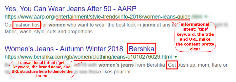
Therefore, it’s essential to denote the intent of the content you provide. If you own an online shop, you should mark transactional intent on your page. Add “buy”, “price”, “purchase”, “on sale”, and other related keywords. If you run a blog, use the phrases with “how to”, “what is”, “best tips”, and more. Denoting intent not only helps search engines rank your website for the relevant queries but also provides users with a better understanding of what they’ll see on your page.
Moreover, users quite often don’t mark their intent in their search queries. One can type “women jeans”, and the machine won’t be 100 percent sure whether a person wants to get some fashion tips or purchase jeans. In this case, the search results will contain both informational and transactional websites. To help your prospects understand if they should click through your site, you’d better denote what type of service you provide.
2. What queries do your prospects conduct?
Even if you think you understand what kind of information concerning your product your target audience may be interested in, don’t jump to conclusions. Working in a niche is pretty different from being a consumer. The words you use to describe what you do may be absolutely unknown for people searching for your product at first.
As we concluded it’s important to know what kind of search queries your potential customer’s conduct. I’ll show you the quickest ways to identify these queries.
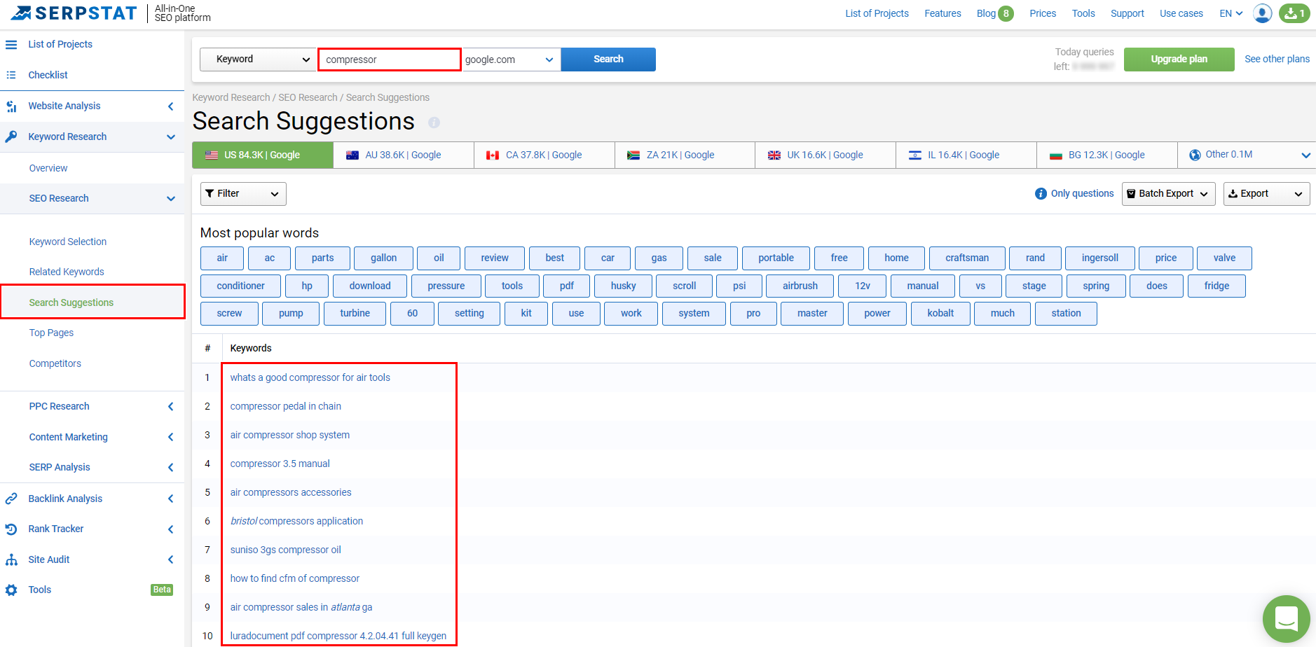
- Serpstat Search Suggestions: Providing the opportunity to research keywords, analyze competitors’ websites, and conduct SEO audit, this tool also provides you with search suggestions related to the researched keyword. These are the queries usually popping up when you start typing your keyword in the search field. Instead of collecting all these variations of queries by yourself, you can go with this tool.
- Answer The Public: This tool specializes in content ideas and keyword research. Enter your main keyword in the search field, and you’ll see the list of questions users ask on the subject.

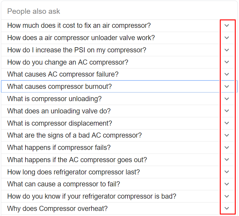
- People also ask: I mean the box in SERP appearing among the search results engines provides to your query. If you pay attention to it, you may find lots of relevant suggestions for you to use in the future. Tap on the arrow near the questions, and you’ll see even more variations.
The next step users undertake after entering the search query is choosing which website from all the search results provides the most comprehensive information. And how do they make a decision? Right, they judge by what they see in the snippet.
The website may contain high-quality and relevant content, but failing to denote it in the snippet, decreases its chances to get high traffic dramatically. In fact, there are two pieces of metadata influencing how your snippet may look.
1. Title tag & meta description
Of course, creating a catchy and intriguing title and description is essential in case you want to attract the audience’s attention. But you should be careful. In the way, a boring title will bring you little profit, the too promising one will also do you no good.
You may say: “There are loads of posts on the subject, I should make my page stand out.” I agree. Partly. You should stand out. But with unique and quality content, not with false promises in your snippets.
Once you promised something that you don’t provide on your page, it’ll increase your bounce rate and hurt user experience.
So, when creating a title tag and meta description, make sure you:
- Provide the main idea of your content in the title
- Emphasize on your competitive advantage in your description
- Denote user intent
- Don’t spam with keyword stuffing
- Don’t make false promises
2. Page speed
After your audience clicked through your website, there’s one more thing they’ll face before seeing the page itself. Page speed is the factor considered not only by search robots but also by users.
If a person (especially a mobile user) should wait for more than several seconds for your server to answer, the chances he or she will return to search results are quite significant. Here’s an infographic by HubSpot.
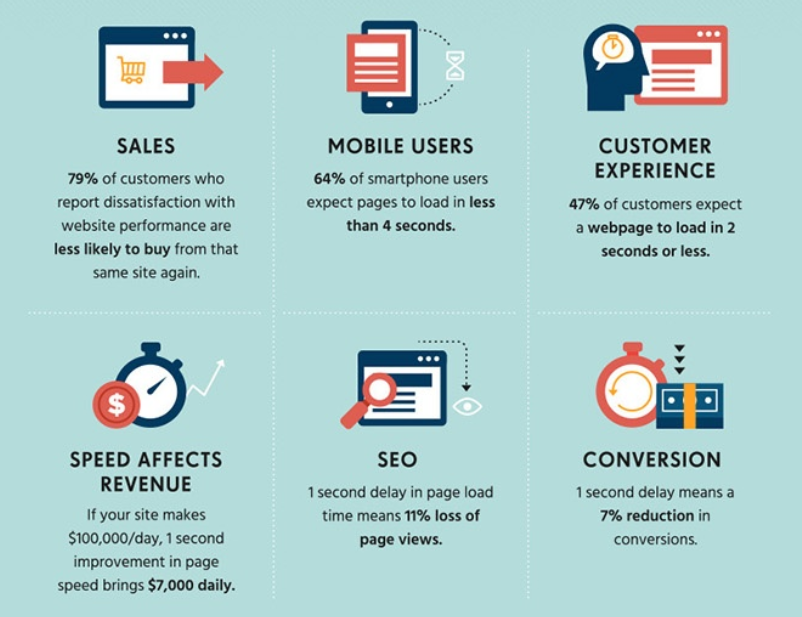
There are services, such as PageSpeed Insights, Serpstat, and Moz, which analyze web pages’ loading speed and generate suggestions to make them faster.
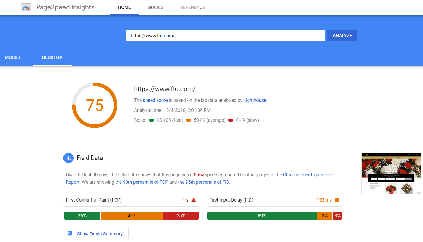
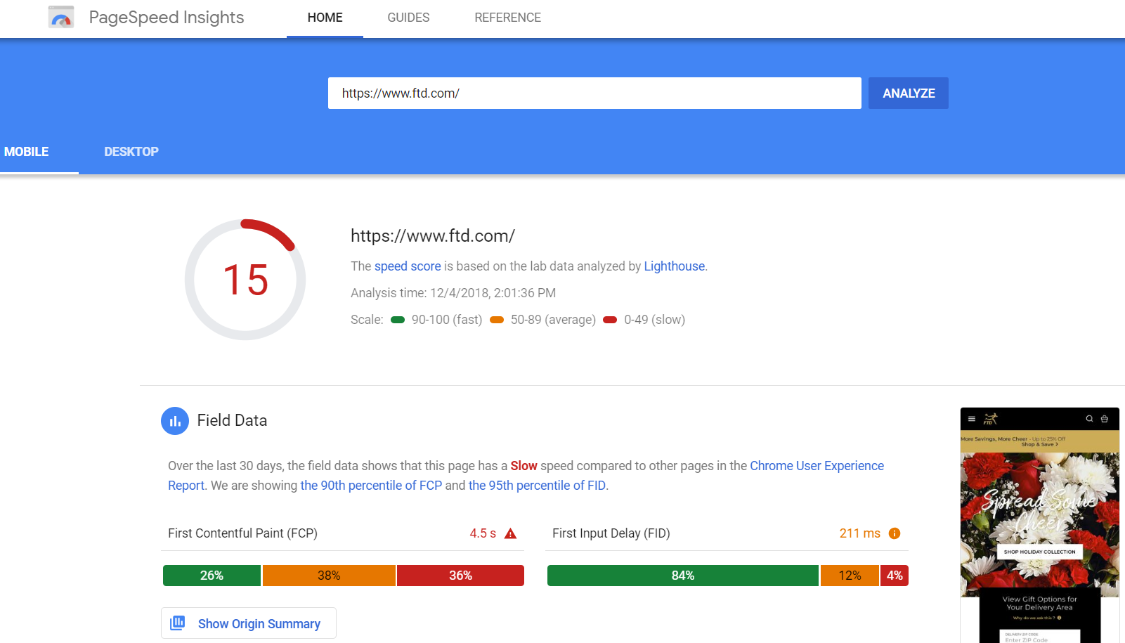
Never forget that 48.2 percent of web page views worldwide account for mobile device users. So, if you don’t want to damage the user experience, it’s worth checking whether your website is mobile-friendly or not. Click on “mobile” to see the analysis of your mobile version. You may be surprised to see that these two versions differ a lot.
Design & content structure
When people have already chosen your website, clicked through it, and waited for it to get loaded, they see your page. What’s the first thing catching the visitor’s eye? The way it looks. Your content may be incredibly authoritative and trustworthy, but once users see it’s impossible to draw the essential data quickly, they might decide the content is too complicated.
I’ve circled out a few tips for you to follow when elaborating your content structure and design:
- The more minimalistic your website looks, the better. It’s pretty easy to overdo when it comes to design. Concentrate not on unusual fonts but on readability of your content.
- Provide a clear structure for your texts. Your visitors should see compelling questions or topics you cover in the headings. It’ll denote they’ll get the answers in the paragraphs below.

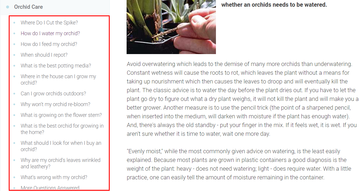
- If your article is long enough, add internal tags to your content in the beginning. It’ll help users navigate if they want to find something specific.
Navigation
Mind that lots of visitors don’t come to your website from your home page. Make sure your website is easy to navigate for users to visit different pages of your website. Remember that the more time people spend on your site, the better the user experience it causes.
First of all, your menu button (or hamburger button) should always be handy. It would be the most convenient to create a fixed header for your web pages. Due to such a header, visitors won’t have to scroll the page after they’ve read your content.
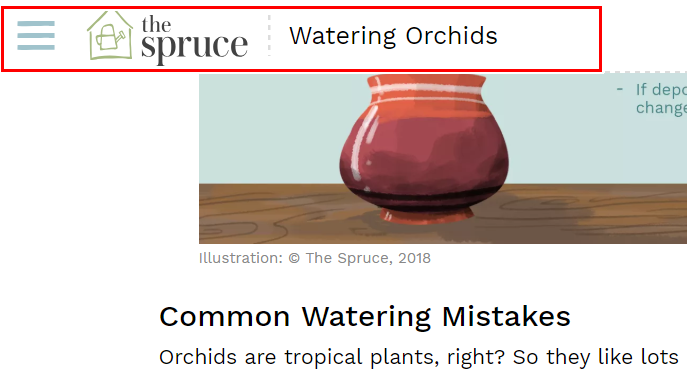
Moreover, when unrolled, the menu shouldn’t overlap the page content. Talking of overlapping, try to avoid pop-ups. All the advertisements overtaking the article every minute cause extremely poor user experience.
Don’t forget to provide clearly labeled categories on the menu. Everything should be organized logically. To make your website even more convenient in the usage, add a search box. If visitors aren’t sure which category contains the necessary information, this box will help a lot.


